Attendance in St. Stephen's College
I've been hunting around for datasets I can relate to for some time now. This fine evening I arrived on the conclusion that I could simply use attendance data from the website of St Stephen's College.
I open up my console and spin up a Python script to get the data from the college website. Takes about two minutes on my Internet connection to collect all the information.
We then proceed to put it in a nice tabular form with columns being Name, percent LA, percent TA, percent PA, admission_year, course.
Things are now ready for graphing.
The complete analysis notebook is available as a gist (here's the gist).
Collecting the data was a matter of inspecting how the website was obtaining it's data. A company has been handling our attendance since the beginning it seems. (GreenClouds site link). As far as I'm concerned they've made a mess of the data transfer as I can see. Perhaps it originated in the college itself, perhaps it's due to some mistakes on the company level. Whatever the cause the data format is a mess.
I open up my console and spin up a Python script to get the data from the college website. Takes about two minutes on my Internet connection to collect all the information.
We then proceed to put it in a nice tabular form with columns being Name, percent LA, percent TA, percent PA, admission_year, course.
Things are now ready for graphing.
Graphs
We go on to make Box plots. If you were to line up people in order of their attendance you would get a box plot. The person in the middle of the line is the line cutting the box in the middle. It shows that there are an equal number of people on either side of the line.
You cut each part of the line in half again and you get the bounds of the box.
This one is a gem. What is up with Chem! The attendance of their Lectures is absolutely ridiculous. While everyone more or less has the same attendance in a course Chem people are all over the attendance spectrum! Then again, their Tutorials box plot is neat too!
Yes. I see it too. Math people are consistently in class with a few people as outliers. Nobody else has this kind of spread.
Perhaps a better way of seeing this would be violin plots where you get to see the density of the people instead of simple boxes. The thickness of the violin denotes how many people people are at that point.
For example we can see that a lot of the math people are high attendance junkies and a substantial amount of CHE, PHY, PCH and, PCS are low attendance lovers.
For example we can see that a lot of the math people are high attendance junkies and a substantial amount of CHE, PHY, PCH and, PCS are low attendance lovers.
There! The average PHI student absolutely does not give a hoot about attendance! The PCH and PCS programs do every class together as is apparent from their spreads. ENG and HST do compete with PHI but PHI does take the cake.
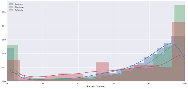
Let's move on to the simplest of all graphs. The Histogram. No explanation needed here.
Let's move on to the simplest of all graphs. The Histogram. No explanation needed here.
Looking at the histograms we can see that almost everyone attends class with the exception of a few people who absolutely don't come to class. Perhaps people who left the course and the administration just did not remove them from roll calls? What about experience?
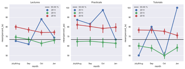
We do a regular point plot to see change in attendance over months. The vertical lines along the points denote a 95% confidence interval.
We do a regular point plot to see change in attendance over months. The vertical lines along the points denote a 95% confidence interval.
The third years have found that perfect balance of leisurely attendance during most of the semester and then picking it up during the last months. First years exhibit that trait of a "नया नया मौलवी" perfectly. Second years have figured out that attendance does not really matter, but are still to find out how badly those marks can affect their marks. With time comes wisdom,
That's it for now. I'd love to do some more if someone can come up with data at a lower granularity.
· · ·


